Reimagining healthcare for the world
Our attitudes to health are changing. And fast. Healthcare isn’t just about managing illness anymore. Our priorities, particularly post-COVID, have shifted. People want a more proactive approach, one that prioritises their long-term wellbeing.
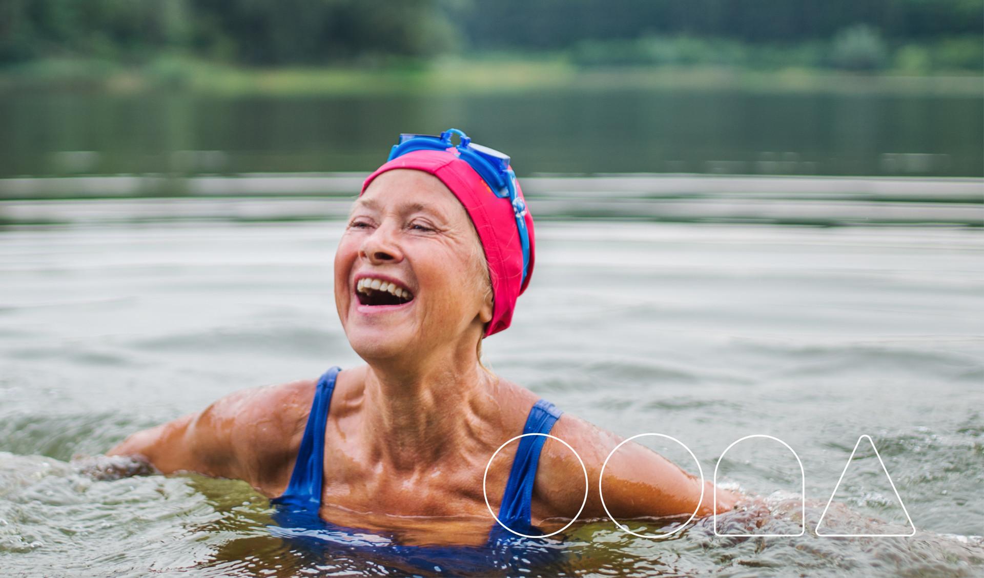
This insight was at the core of the strategic positioning we developed for Oona Health's new brand identity: reimagining healthcare for the world. Operating at the intersection of digital, data and healthcare expertise, Oona connect their customers to the right care, efficiently and seamlessly, to help them live a healthier, happier life.
The heart of Oona's identity
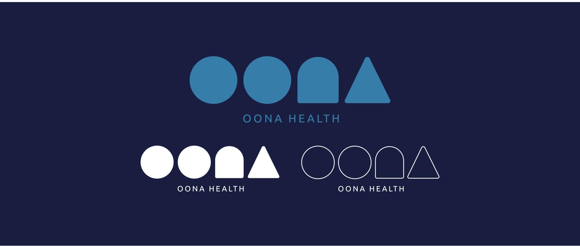
Healthcare is personal - Oona understand that on a deep level. And what’s more personal than DNA? Each of us has our own unique, entirely personal code. The idea of these distinct patterns formed the basis of Oona’s wordmark, central to their identity.
It’s a subtle nod to Oona’s Danish roots too. With global appeal, but built on the simplicity of Danish design, the minimalistic shapes translate across multiple platforms, unconstrained by format.
Oona’s name also reflects the company’s values – literally. The letters come from their guiding principles to Observe, Orientate, Navigate and Act. So their name is a constant reminder of who they are and how they behave.
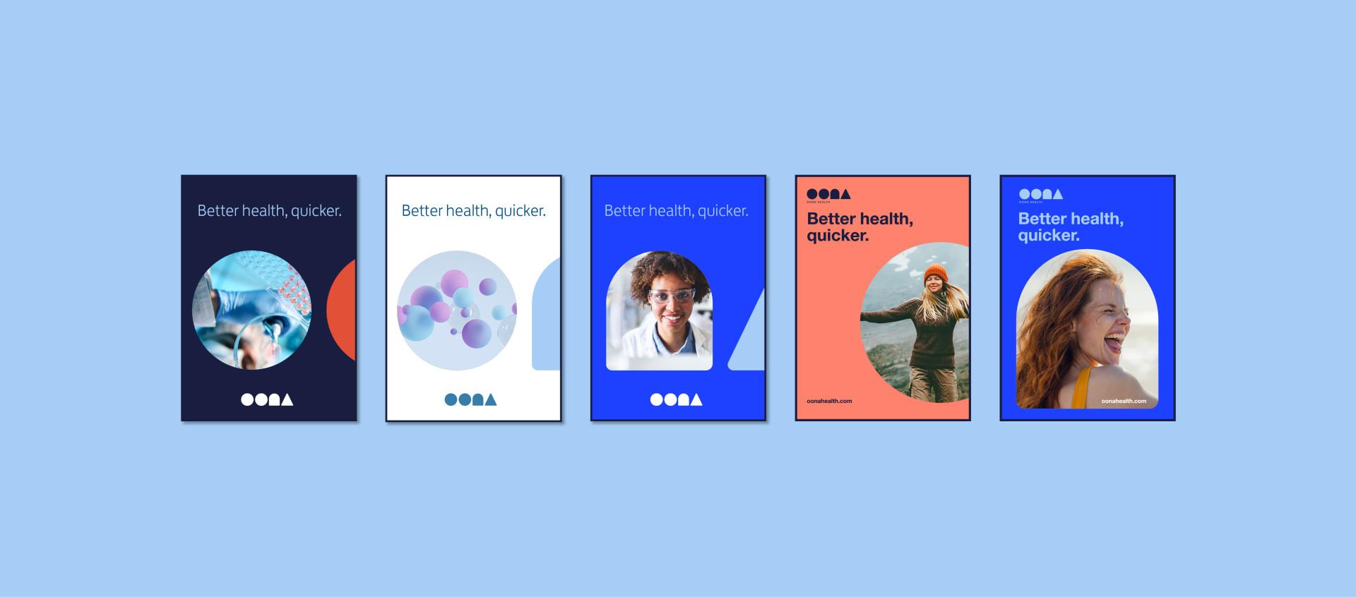
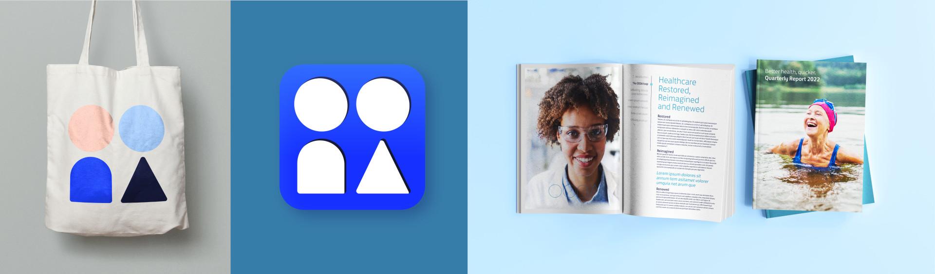
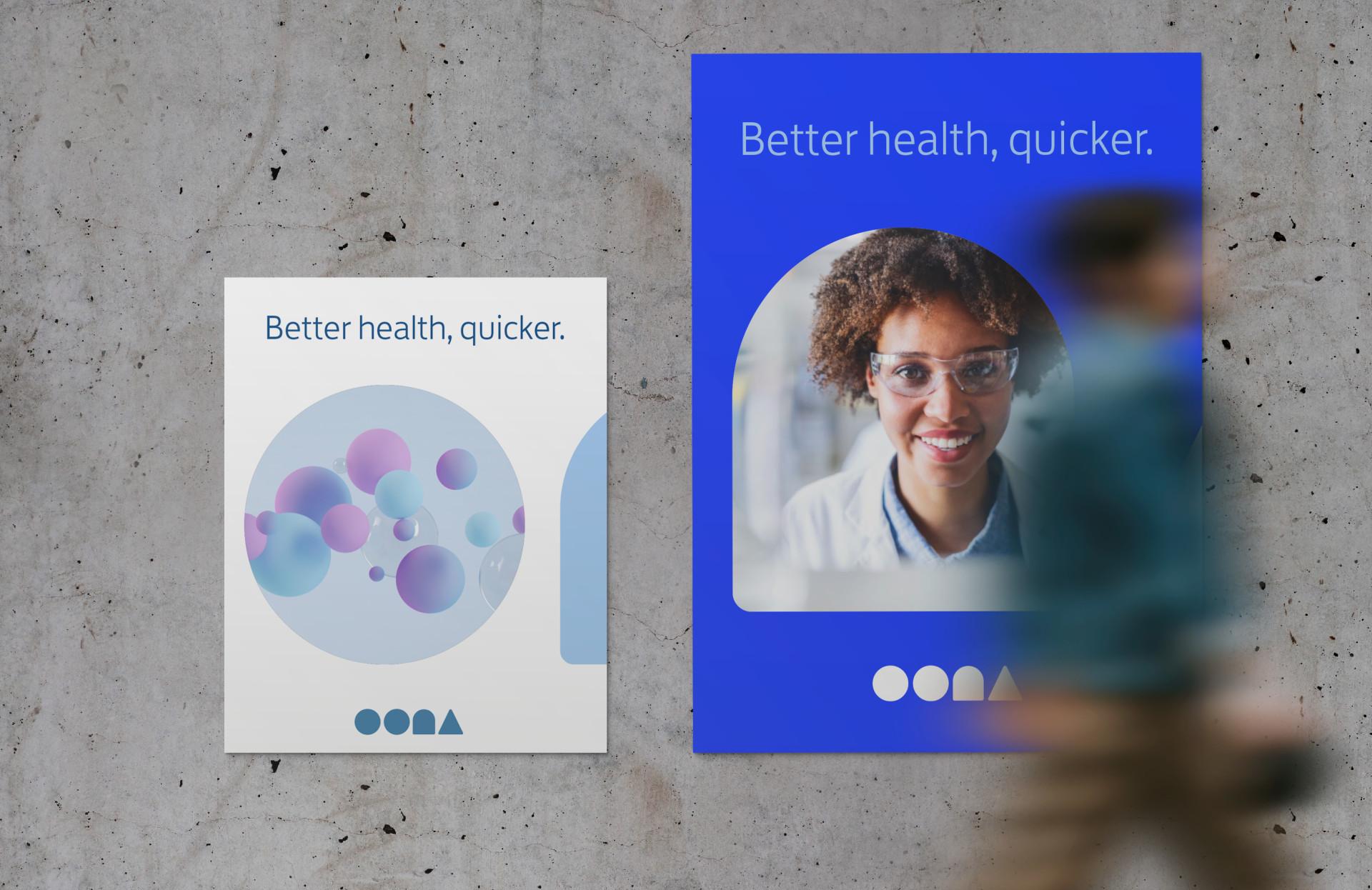
The name, wordmark, and full identity were brought to life in the brand’s new website.